


The OLDIES vs. The NEWBIES


Loved the DRAMA of the original. I didn't read this one, but I think it just fit a book set in the 30s. The new is pretty, like the font, but it's not as interesting and doesn't give as much of a sense of the book.


The original was only okay for me in the first place, but on the second, the girl looks a little cartoony to me. Meh on both.


Both pretty gorgeous! Love the boldness of the original, and I want that girl's tealy blue highlights! :)


I love the humor in both of these, but all the color and dimension of the original really draws my eye and makes me want to read it!!


I don't like the new :( There was just something about the elegant font and the bold, stark bloody infinity symbol that was perfect.


Ack. This change is just a NO for me.
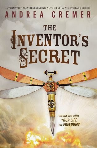

I'm glad they stuck with the font! I never really liked the dragonfly (if anyone remembers, this cover originally had a clockwork anatomical heart on it, and I loved that!). I actually like the new one better for these! Very dramatic and gorgeous steampunk fashion! :)
Let me know what you think! New or Old?


Oh I love them all <3 but my favorite out of these has to be Mortal Danger :)
ReplyDeleteMortal Danger :( THE HURT. I do not like the new covers either. Sad face. The old one was so pretty :( And Dark Metropolis.. new one is not that pretty :\ The Impossible Knife of Memory.. yeah, both covers are pretty gorgeous :) but I sort of hated the book :p Sad face. ANYWAY. Gorgeous post Becky :D Thank you for sharing about all these new gorgeous covers. <3 I also don't like the covers for Black Ice. Sigh.
ReplyDeleteI actually prefer the new cover of Dark Metropolis! Though I definitely like the old cover of The Impossible Knife of Memory better. Agree with you about Me, Earl and the Dying Girl! And Mortal Danger - why did they change it? The first cover was great!
ReplyDeleteIs it bad that I only like two of the new covers? I like Laurie Halse Anderson's and Andrea Cremer's....the rest I think they should have stuck to the original or something similar....especially with Dark Metropolis. I haven't read it either, but I thought the original cover was pretty great. Happy Friday, Becky!
ReplyDelete