


The OLDIES vs. The NEWBIES
Well, nothing that make me truly crazy this time---not like last time LOL.
Introducing, the new and ...improved? What do you think?
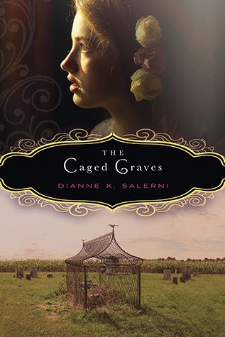

Both of these are pretty, but both also looks like adult books. I think I prefer the original with the title banner and the face of the young girl---makes it a little more obvious that it's YA.


I like both, really. I do like the way the original gives you a better hint of the setting.


Original, definitely. New one's a bit too "plain ol' chic-lit". I loved the title work on the original and I wish they'd kept the original tag-line.


Bit undecided on this one. The original definitely makes a statement but I loved the scratched up wash over the city image on the new.


Original wins. Could they have gone more generic with the silhouetted image? Love the flat-iron building in the back on the original, plus Catherine looks like a bad-ass. :)


Neither cover gives me any clue about the story inside, but design-wise I do like the new one better.
Tell me whatcha think!!
*UPDATED TO ADD*
Stop the presses! LOL just came across one more that went live today.
A new look and title for Melissa Marr's Carnival of Souls:


Same book so be sure not to buy it twice (unless you want to, of course!) :) Not sure why the change of title, but the new one is pretty. Though it kind of looks like she's lying in blue pudding. :D
*UPDATED TO ADD*
Stop the presses! LOL just came across one more that went live today.
A new look and title for Melissa Marr's Carnival of Souls:
Same book so be sure not to buy it twice (unless you want to, of course!) :) Not sure why the change of title, but the new one is pretty. Though it kind of looks like she's lying in blue pudding. :D


I just realized they changed Carnival of Souls, it gives such a different tone. I'm not a big fan of the new Catherine cover but I like it.
ReplyDeleteMost of these original covers are gorgeous! (the adjective not referring to the book featured) Why would they change them? If it ain't broke, Don't fix it!
ReplyDeleteWhy'd they lose the original one for Gorgeous? It was so much better! The new Carnival of Secrets one is very cool.
ReplyDeleteArgh, cover changes! I like the new Carnival of Secrets cover, but that's about it when it comes to the redesigns. The Dangerous Girls redesign is AWFUL, it gives me bad vibes. I'm especially sad about the Proxy redesign! I love the original.
ReplyDeleteI like the new Carnival of Secrets and Dangerous Girls. I think I prefer the old Caged Graves, Gorgeous, and Catherine.
ReplyDeleteI haven't read it yet, but I like the original Carnival of Souls better. The fire mask is just really cool and unique. If I saw the blue pudding version I don't think i'd be interested at all.
ReplyDeleteI kind of like the new Caged Graves, but I agree that the first one looks a little more YA.
And I agree, the original version of Gorgeous is much better.
But.. why new title for Carnival of Souls? :( Do not approve, lol. Not sure I like the new cover either.. hmm. Been ages since I read the book, though, but I did love it :) Lots of awesome covers in this post! Thank you for sharing. <3
ReplyDeleteI think I prefer the originals for all of these, except Me, Him, Them and It. I do like both for The Caged Graves, but I prefer the font on the first one. And no idea why they changed the cover and title for Carnival of Souls! It was great as it was.
ReplyDelete