The OLDIES vs. The NEWBIES
Well, nothing that make me truly crazy this time---not like last time LOL.
Introducing, the new and ...improved? What do you think?
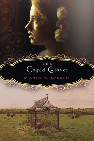
Both of these are pretty, but both also looks like adult books. I think I prefer the original with the title banner and the face of the young girl---makes it a little more obvious that it's YA.
I like both, really. I do like the way the original gives you a better hint of the setting.
Original, definitely. New one's a bit too "plain ol' chic-lit". I loved the title work on the original and I wish they'd kept the original tag-line.
Bit undecided on this one. The original definitely makes a statement but I loved the scratched up wash over the city image on the new.
Original wins. Could they have gone more generic with the silhouetted image? Love the flat-iron building in the back on the original, plus Catherine looks like a bad-ass. :)
Neither cover gives me any clue about the story inside, but design-wise I do like the new one better.
Tell me whatcha think!!
*UPDATED TO ADD*
Stop the presses! LOL just came across one more that went live today.
A new look and title for Melissa Marr's Carnival of Souls:
Same book so be sure not to buy it twice (unless you want to, of course!) :) Not sure why the change of title, but the new one is pretty. Though it kind of looks like she's lying in blue pudding. :D


